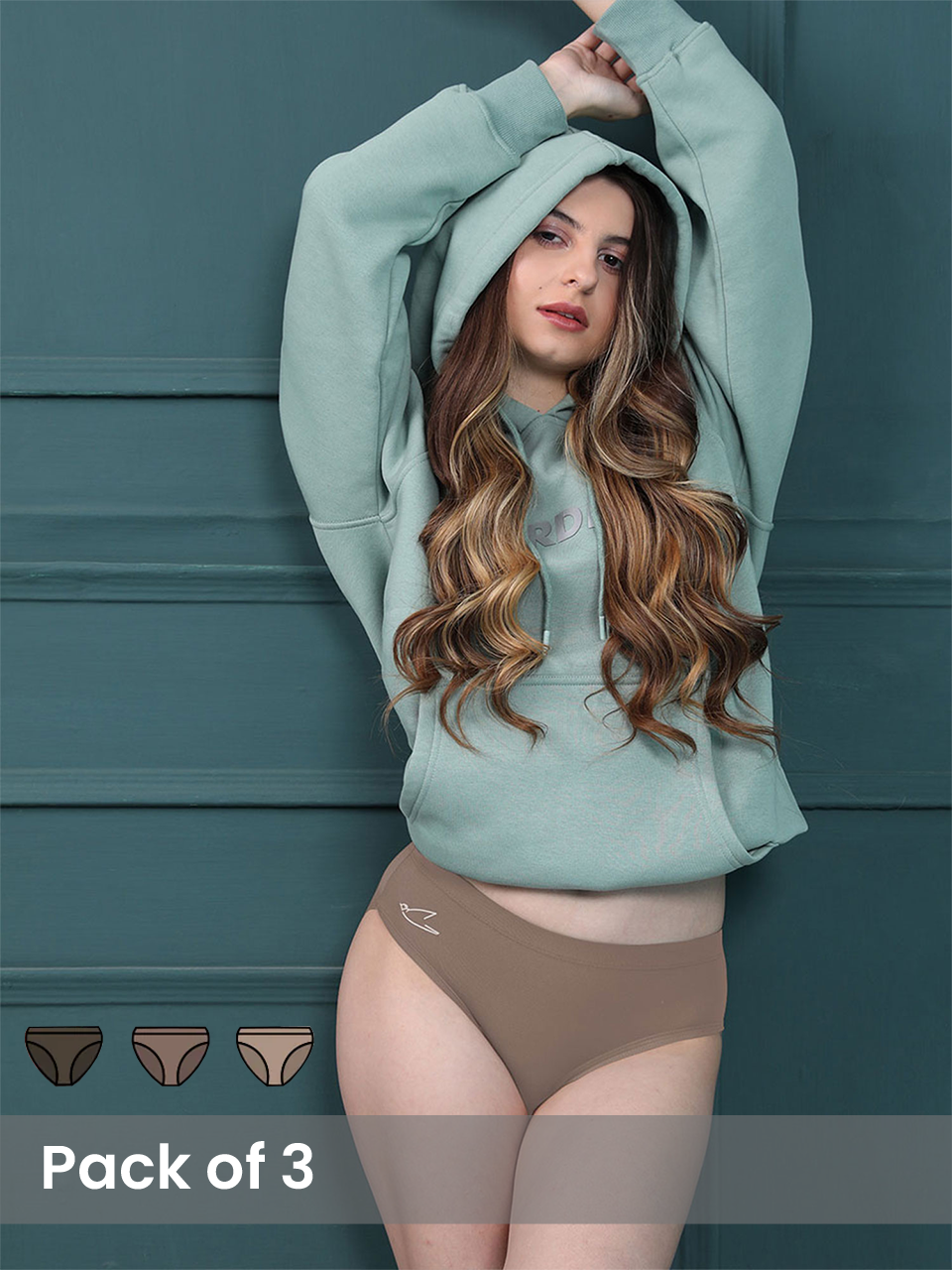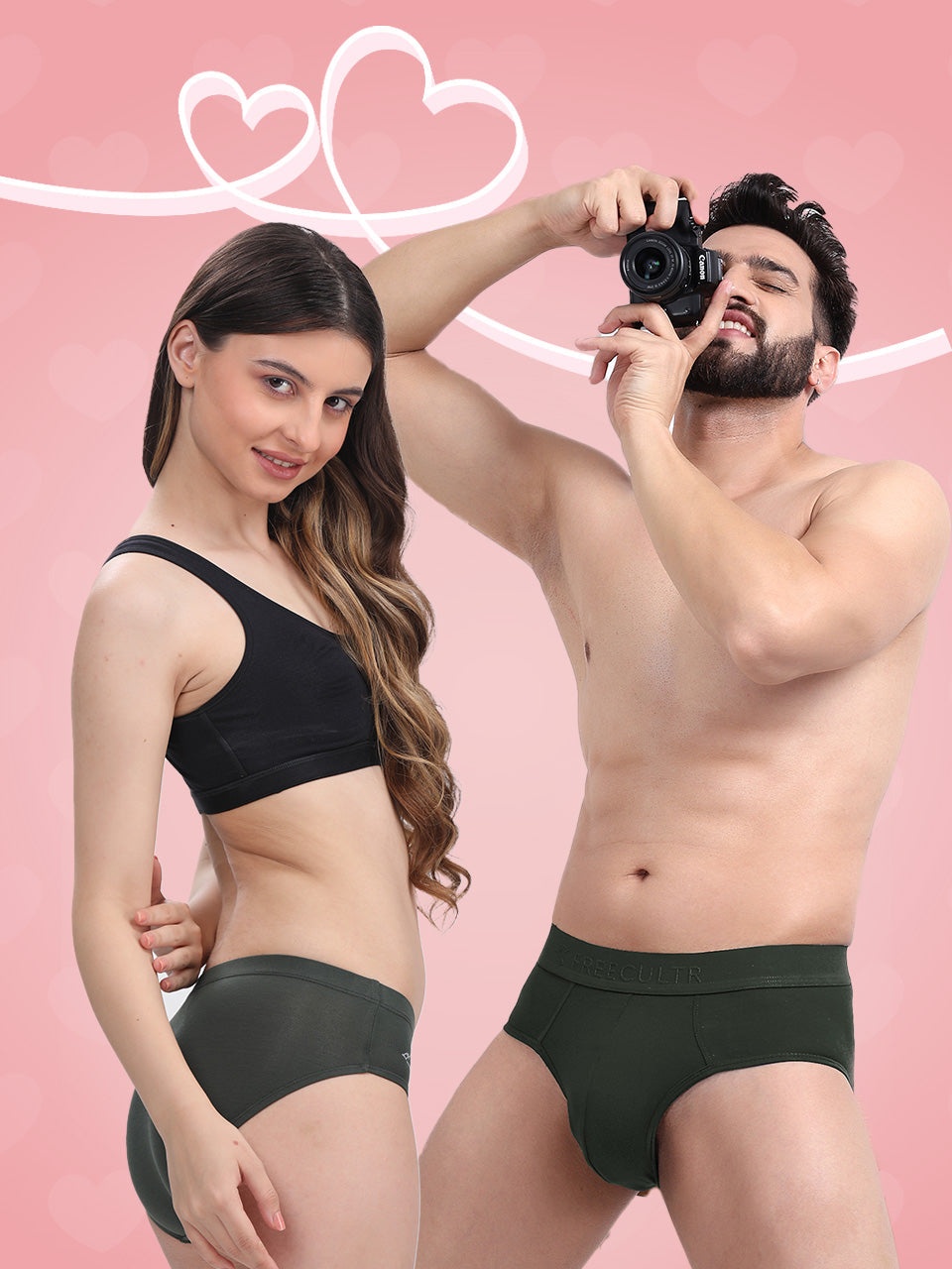


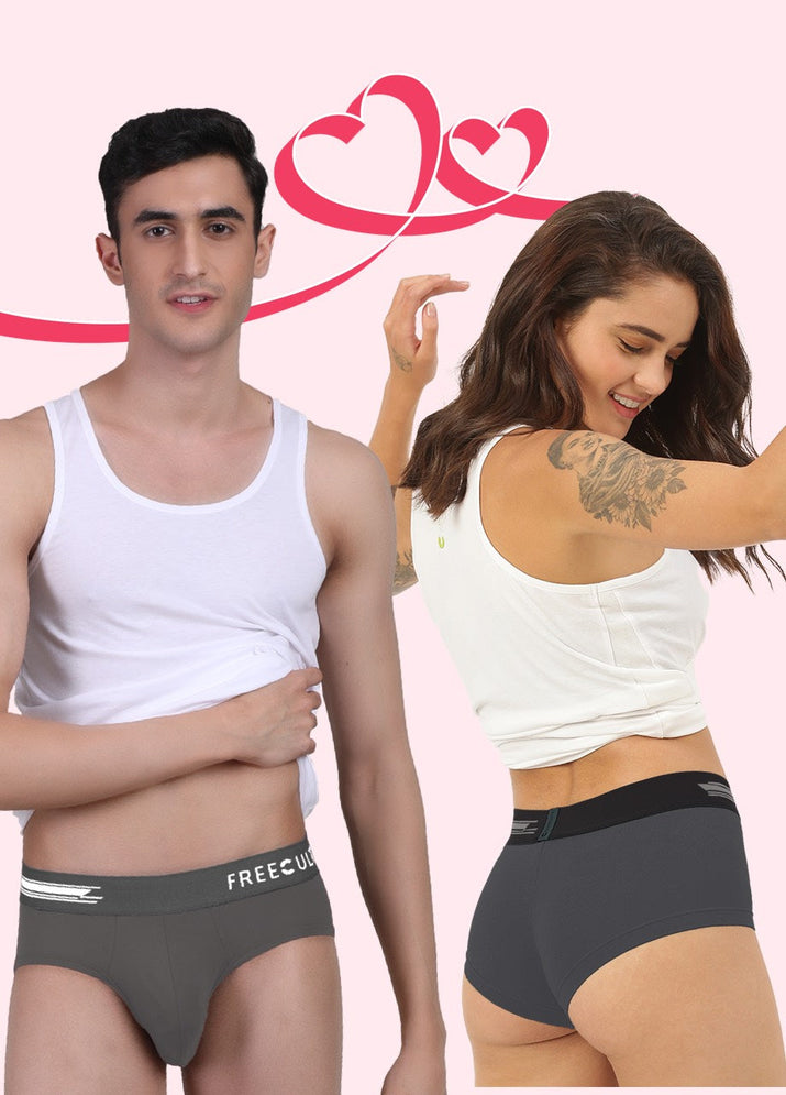
The Indian innerwear market is booming, with brands like Freecultr and Damensch vying for dominance. Both offer comfort and quality. Freecultr often captures a trendier aesthetic. To interpret why, we'll dissect their differing approaches to color and pattern selection. Freecultr leverages bolder, more experimental palettes often inspired by global streetwear and digital art trends, demonstrated in their recent collaboration featuring abstract geometric prints. We'll assess how this contrasts with Damensch’s reliance on classic, muted tones, exploring how their choices reflect distinct target demographics and brand identities. Key evaluation factors will include trend adoption speed, color psychology applications. The overall impact on consumer perception.

Deconstructing Trendiness: A Look at Color and Pattern Choices
Understanding why one brand's color and pattern choices resonate more with consumers than another's requires dissecting the core elements that contribute to perceived "trendiness." This involves analyzing several factors, including:
- Color Palette Selection: Are the colors used aligned with current seasonal forecasts and broader cultural shifts?
- Pattern Design: Do the patterns feel fresh and innovative, or are they derivative of existing trends?
- Target Audience Alignment: Does the brand interpret its target audience's aesthetic preferences?
- Marketing and Branding: How effectively is the brand communicating its design vision and creating desire for its products?
- Material and Print Quality: Do the colors and patterns translate well onto the chosen fabrics, maintaining vibrancy and clarity?
Ultimately, perceived trendiness is a subjective measure, influenced by individual taste, social context. Marketing effectiveness. But, by examining these elements, we can gain a clearer understanding of the factors that contribute to a brand's success in the competitive apparel market.
The Power of Color Psychology and Seasonal Palettes
Color psychology plays a significant role in how consumers perceive a brand and its products. Different colors evoke different emotions and associations. For example, blues often convey trust and stability, while reds represent passion and excitement. Staying ahead of Fashion Trends involves not just understanding these basic principles. Also anticipating how color preferences will evolve over time.
Seasonal color palettes are crucial. Pantone, for instance, releases seasonal color trend reports that influence designers across various industries. Brands that successfully incorporate these trending colors into their collections are more likely to be perceived as fashionable and contemporary. But, simply using trending colors is not enough. The colors must be used in a way that complements the brand's overall aesthetic and appeals to its target audience.
Pattern Innovation: Beyond the Basics
Pattern design is another key differentiator. While classic patterns like stripes and florals remain popular, innovative brands are constantly experimenting with new techniques and styles. This can include:
- Geometric Abstraction: Creating complex and visually stimulating patterns using geometric shapes.
- Digital Prints: Utilizing digital printing technology to create highly detailed and realistic patterns.
- Abstract Art Influences: Drawing inspiration from abstract art movements to create unique and expressive patterns.
- Nature-Inspired Motifs: Interpreting natural elements in unexpected and artistic ways.
Moreover, the scale and placement of patterns can significantly impact the overall look and feel of a garment. A small, delicate pattern can create a subtle and sophisticated effect, while a large, bold pattern can make a statement.
Understanding the Target Audience: Knowing Your Customer
A brand's success hinges on its ability to comprehend its target audience. This involves not only identifying their demographic characteristics (age, gender, income, etc.) but also understanding their lifestyle, values. Aesthetic preferences. What Fashion Trends are resonating with them? What colors and patterns do they find appealing?
Market research, social media listening. Customer feedback are essential tools for gaining these insights. Brands can use this details to tailor their color and pattern choices to appeal specifically to their target audience. For example, a brand targeting young, urban consumers might opt for bold, graphic patterns and vibrant color palettes, while a brand targeting older, more sophisticated consumers might prefer more subtle and classic designs.
The Role of Marketing and Branding in Shaping Perceptions
Even the most well-designed products can fail to gain traction if they are not effectively marketed and branded. Marketing plays a crucial role in shaping consumer perceptions and creating desire for a brand's products. This involves:
- Visual Storytelling: Using imagery and video to communicate the brand's aesthetic vision and the story behind its designs.
- Influencer Marketing: Partnering with influencers who align with the brand's values and target audience to promote its products.
- Social Media Engagement: Creating engaging content on social media to build a community around the brand and its products.
- Public Relations: Securing media coverage in relevant publications to increase brand awareness and credibility.
A strong brand identity can also help to create a sense of exclusivity and desirability, making consumers more likely to perceive the brand's products as trendy and fashionable.
Material and Print Quality: The Foundation of Visual Appeal
The choice of materials and the quality of printing are critical factors in determining the final visual impact of a garment. Even the most innovative color and pattern designs can fall flat if they are not executed properly on high-quality fabrics. This involves:
- Fabric Selection: Choosing fabrics that complement the design and enhance the colors and patterns.
- Print Techniques: Utilizing appropriate printing techniques to ensure vibrant and long-lasting colors.
- Colorfastness: Ensuring that the colors do not fade or bleed after washing.
- Fabric Durability: Selecting fabrics that are durable and resistant to wear and tear.
Investing in high-quality materials and printing processes is essential for creating products that look and feel luxurious. That will stand the test of time.
Case Study: Analyzing Color and Pattern Trends in Athleisure
The athleisure market provides a compelling example of how color and pattern trends evolve. Initially, athleisure focused on neutral tones and functional designs. But, as the trend matured, consumers began seeking more expressive and fashionable options.
Brands that successfully capitalized on this shift embraced bolder color palettes, incorporating neon accents, pastel hues. Unexpected color combinations. They also experimented with a wider range of patterns, including abstract prints, camouflage variations. Graphic logos. Moreover, they used innovative printing techniques to create visually stunning designs on performance fabrics.
This example demonstrates the importance of staying attuned to evolving consumer preferences and adapting color and pattern strategies accordingly.
Conclusion
Freecultr's edge in trendy colors and patterns over Damensch boils down to a commitment to bold experimentation and a finger firmly on the pulse of contemporary culture. While Damensch leans towards classic, often muted tones, Freecultr embraces vibrant palettes and eye-catching designs that resonate with today's fashion-forward consumer. The Implementation Guide Remember, staying relevant in the fashion world requires constant innovation. Don't be afraid to push boundaries with your designs, drawing inspiration from art, music. The ever-evolving digital landscape. A practical tip is to actively engage with your target audience through social media polls and feedback sessions to gauge their preferences. Your action item is to assess recent runway trends and translate them into wearable, unique designs that capture the essence of Freecultr's brand identity. Success will be measured by increased social media engagement, positive customer reviews praising the designs. Ultimately, a higher conversion rate for new collections. By embracing this approach, Freecultr can solidify its position as the go-to brand for stylish and comfortable innerwear.
More Articles
Why are Freecultr prints more modern than Jockey’s classic styles?
Is Freecultr’s eco-friendly fabric better for the planet?
What makes Freecultr ideal for lounging and travel?
Is Freecultr more ergonomic than Damensch for everyday movement?
FAQs
Okay, so what's the deal? Everyone's talking about Freecultr's colors and patterns. What makes them 'trendier' than Damensch?
Alright, let's break it down. While both brands offer solid basics, Freecultr often leans into more current fashion trends with their color palettes and designs. They seem to be quicker at adopting seasonal hues and incorporating patterns that are 'in' right now. Damensch, on the other hand, tends to stick with a more classic and timeless approach, which isn't necessarily a bad thing, just less 'of the moment'.
Is it just about bright colors? I see Damensch has some colorful options too.
It's not just about brightness. It’s more about the specific shades and how they're used. Freecultr seems to nail the trending color stories – think muted pastels one season, bold neons the next. Damensch Might not be what’s dominating Instagram feeds at the moment.
What kind of patterns are we talking about here? Are they, like, wild and crazy?
Not necessarily wild and crazy! Freecultr experiments more with subtle patterns and prints that are popular. This could mean anything from minimalist geometric designs to updated versions of classic patterns like stripes or polka dots. Think of it as more 'design-forward' compared to Damensch's plainer options.
So, Freecultr is always chasing the latest trends. Damensch is more about staying safe? Is that a fair summary?
Pretty much! Freecultr seems to be actively trying to capture the zeitgeist with their designs, which inherently makes them feel trendier. Damensch prioritizes comfort and timelessness, so they're less focused on fleeting fads.
Does Freecultr use better designers or something? Is that why their stuff looks cooler?
It's hard to say definitively if one brand has 'better' designers. But it's likely that Freecultr is investing more in trend forecasting and market research to identify the colors and patterns that are resonating with consumers right now. This allows them to curate collections that feel fresher and more relevant.
Okay, I get it. Trendier doesn't always mean better though, right? What are the downsides of being so trend-focused?
Exactly! The downside of chasing trends is that what's 'in' today might be 'out' tomorrow. So, Freecultr's styles might feel dated sooner than Damensch's more classic pieces. It really depends on whether you prioritize being on the cutting edge or building a wardrobe of timeless staples.
If I want to look like I stepped out of a style blog, I go Freecultr?
You got it! That's a great way to think about it. It all boils down to your personal style and what you're looking for in your clothing.